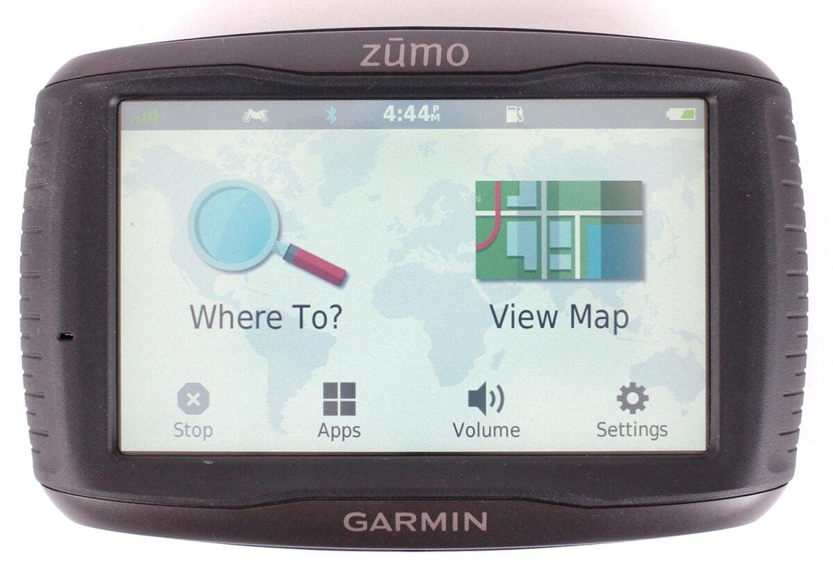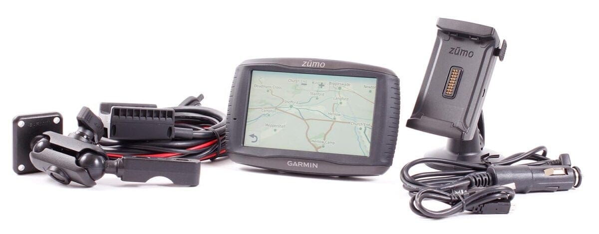
Tested by: John Milbank | £549.99 | www.buy.garmin.com | 0808 238 0000
There’s something of a rivalry between fans of the two sat-nav powerhouses, Garmin and TomTom. Much like users of PCs and Macs, owners very rarely even want to acknowledge the alternative.
For the last couple of years I’ve used TomTom’s Rider 400 and 410 – when the platform was released, one of the engineers told me that the company wanted to be the Apple of sat-navs, making systems that were stylish and easy to use. I can’t think of a better analogy…
Enjoy everything MSL by reading the monthly magazine, Subscribe here.
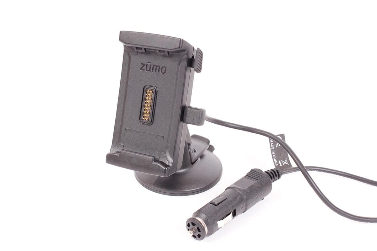
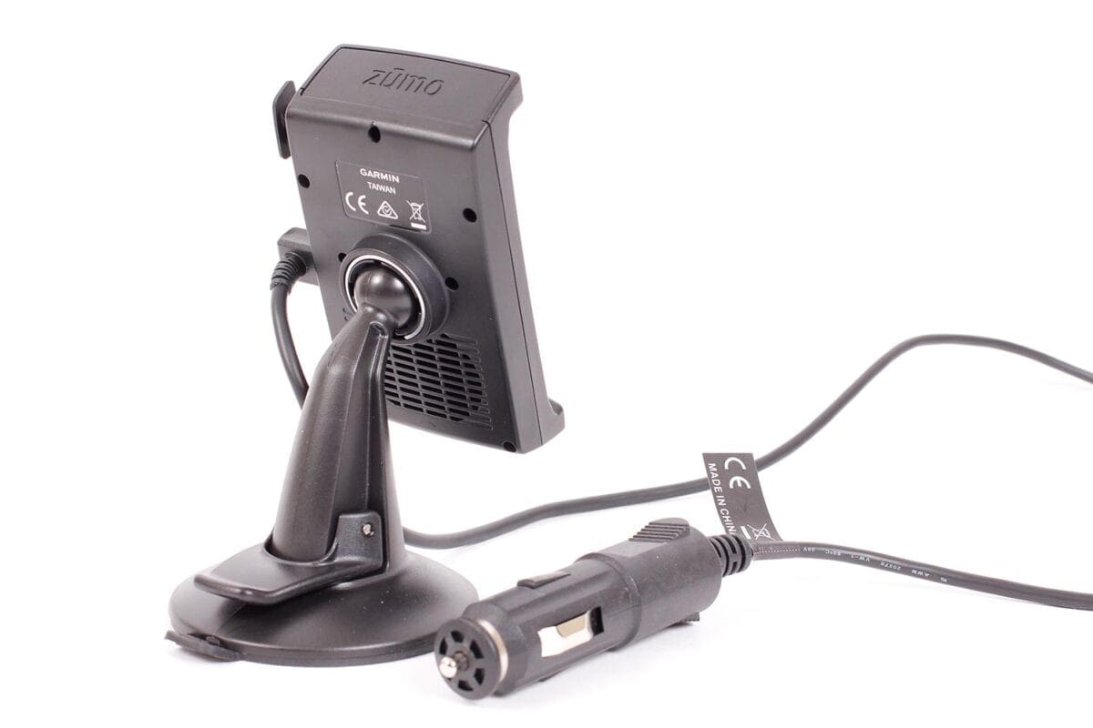
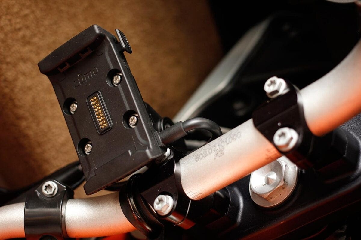
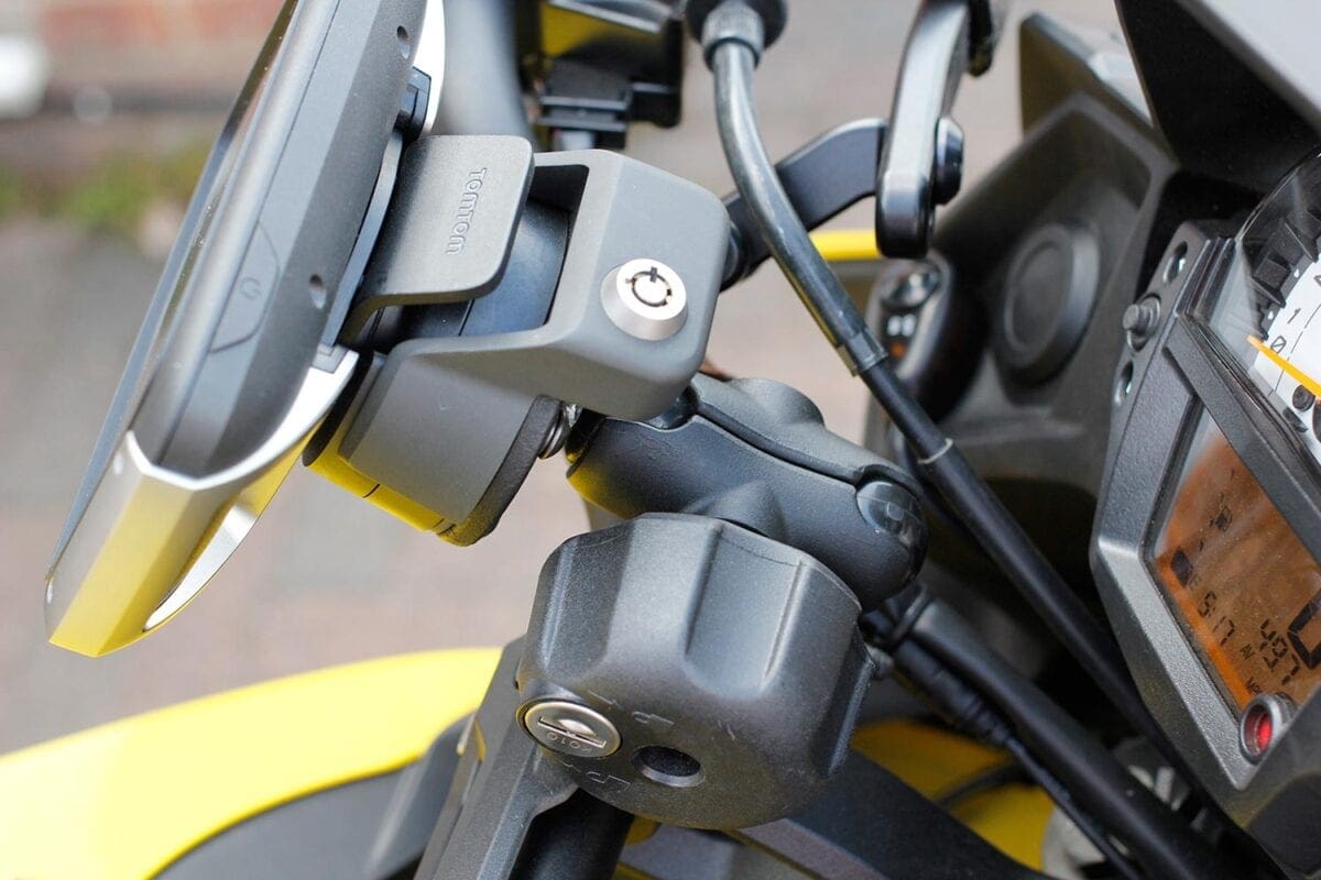
The Garmin Zumo 595 carries full European maps (TomTom’s £429.99 Rider 410 Premium Pack has the entire world), which like its competitor are updated for free for the lifetime of the unit (you must update the maps at least once every two years). Like the TomTom, a car mount is included, though unfortunately you don’t get a locking bike mount. While I wouldn’t leave the TomTom on the bike outside overnight, when paying for fuel or popping to the loo, it’s a very handy addition. Touratech does offer a locking mount, though it’s £124, or Zumolock.com sells one for 79 Euros.
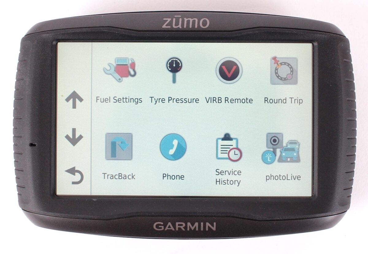
The bike mount has a very thick supply cable, though this also includes audio in and outs for wired intercom systems and music, as well as a USB data connector, which can be used to charge your phone. Optional tyre pressure monitors are available, though they cost £79.99 per tyre.
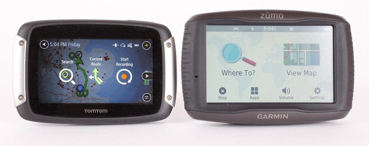
The Garmin’s screen measures 108x65mm, whereas the TomTom’s is 95x54mm – that’s a hefty 37% larger area, but you wouldn’t think it. Thanks to a complete rethink of the display’s layout, the TomTom’s scrolling sidebar and compact but clear notifications help make much better use of the space, and create a more compact overall unit.
The Garmin uses a more traditional touch screen – it’s accurate and reliable, but feels a little old-school compared to the TomTom’s capacitive screen (the same as used on smartphones). But the real difference is in legibility – while the Rider is bright and contrasty, giving a wonderfully clear display in almost all lighting conditions, the Zumo is rather washy, and even on an overcast day can require staring at to read… not great at 70mph. When the sun’s at the wrong angle, it can become completely illegible.
Firing the Garmin into life, you’re presented with an irritating safety warning – it disappears after several seconds, or you can click ‘I agree’, but like a PC, it’s things like this that bug me. Equally, if the Bluetooth connection to your phone is lost (I was using an iPhone 6), a message appears for a few seconds that covers the map. This happened five times in the centre of London, often at the worst possible time. When the connection is automatically renewed, regardless of whether you were streaming music previously, it suddenly starts again… another distraction.
So all this would probably lead you to believe that I’m a TomTom fanboy, and that I think the Garmin is the inferior product. Not so fast… there are some fantastic features on the Garmin, and if you’re the kind of person who likes drilling down to the details of your route planning, it’s got a lot going for it.
Useful features
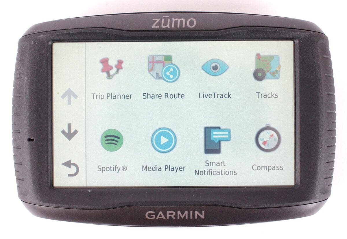
While the sudden music did annoy me, the way the Garmin works with your smartphone is brilliant. Unlike the TomTom (at the time of writing), the Garmin app, which needs to be running to provide traffic (essential in the car, and very useful on the bike) and speed camera information to the Zumo, also lets you browse your iPhone’s playlists, or search for music by artist, album etc. Plus, with a tab on the main map screen, you can easily pause or skip forward tracks. As someone who enjoys listening to music while riding, this is a huge advantage. An Android phone allows you to skip between tracks, but doesn’t give the full browsing ability of iOS. MP3s can also be uploaded to the Garmin directly.
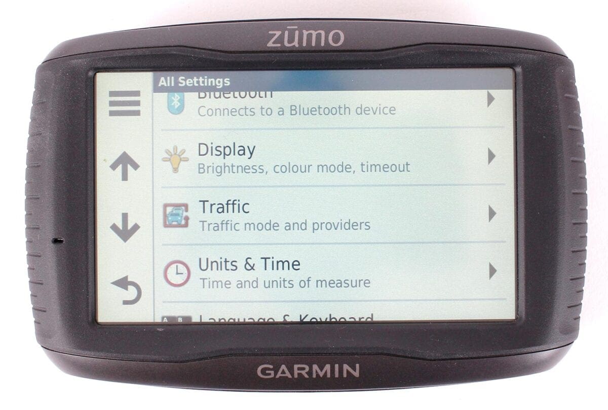
The music interface is provided by Garmin’s well-featured Smartphone Link app, which also gives access to your phone, with alerts for text messages, calls, and app alerts. It’s important to activate two Bluetooth connections on your phone for this – something that took me a while to realise as they’re both named the same. Brilliantly – if you like being connected – the Garmin will read out text messages through your intercom. There’s also a Live Track feature, to share your location on social media, and the ability to stream music through your Spotify account. Of course, all this data use will have an impact on you phone’s tariff, as well as its battery.
Unlike the Rider, there’s no speaker built into the Zumo, which relies on a connected headset, or the speaker built into the car mount. It’s unlikely this will bother many people, though when riding in town with an open-face lid, the TomTom can be heard enough to warn you of an approaching junction.
Warnings are something the Garmin excels at – particularly useful is the notification that the speed limit is soon to reduce. Of less limited value is the fatigue warning, the corner warning (maybe useful in America?), and the animal crossing warning. Fortunately, they’re all selectable.
Clever details
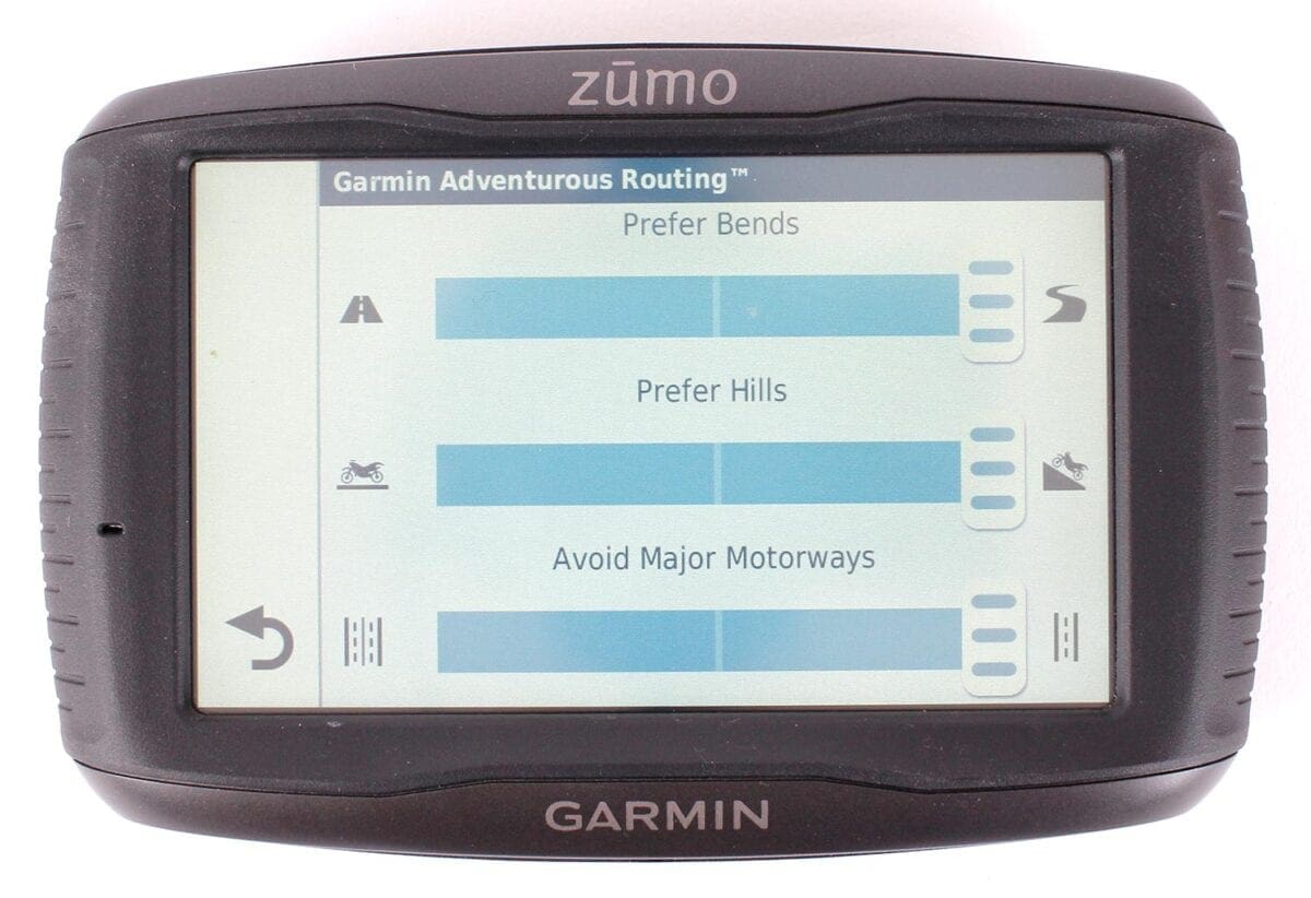
Like TomTom’s ‘Winding Routes’ feature, which plots a more enjoyable journey on back-roads, Garmin’s ‘Adventurous Routing’ allows you to set the parameters for the amount of bends, hills, and the degree to which motorways are avoided. On the TomTom, you can choose to plan a winding route or a fast route direct from the home screen, but with the Garmin you need to delve into the menu structure to select the mode. The problem is that you could forget, not noticing that you’re being taken via back roads. Of course, the route is automatically recalculated when the option is changed.
The adventurous routes, even when set to their maximum parameters, aren’t as enjoyable as those generated by the TomTom – the unit doesn’t appear to try as hard to find the twistiest routes, still often taking advantage of major A-roads. Having said that, the TomTom can take you on roads that would be no fun at all on a sportsbike, but on my KTM 1050 Adventure, I do enjoy the bumpy B-roads.
More impressive is the ability to plan a round trip, based on the distance you want to ride, time to ride, or a destination – this is great if you have some spare time and just fancy a blast. You’re given the choice of two routes, which aren’t always the same – repeatedly planning a one-hour ride from home gave me six different options, and while they could have been twistier, this is another game-changing feature.
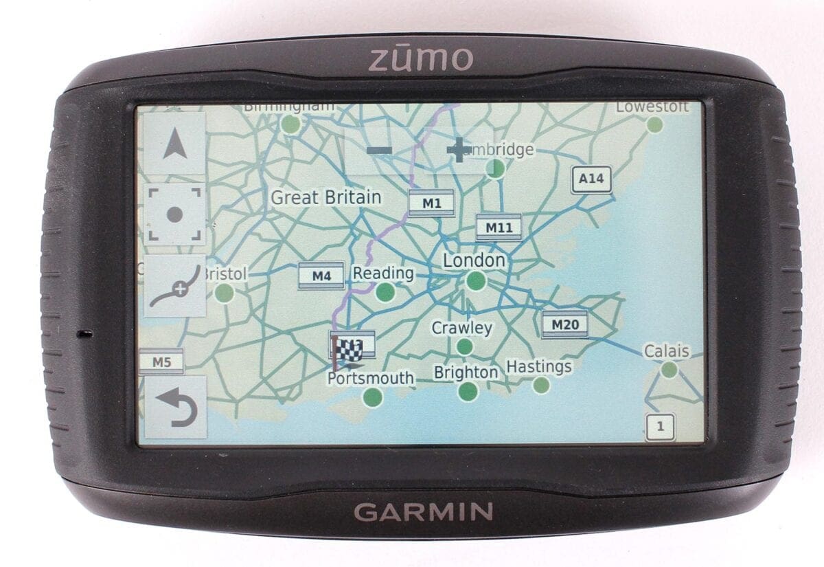
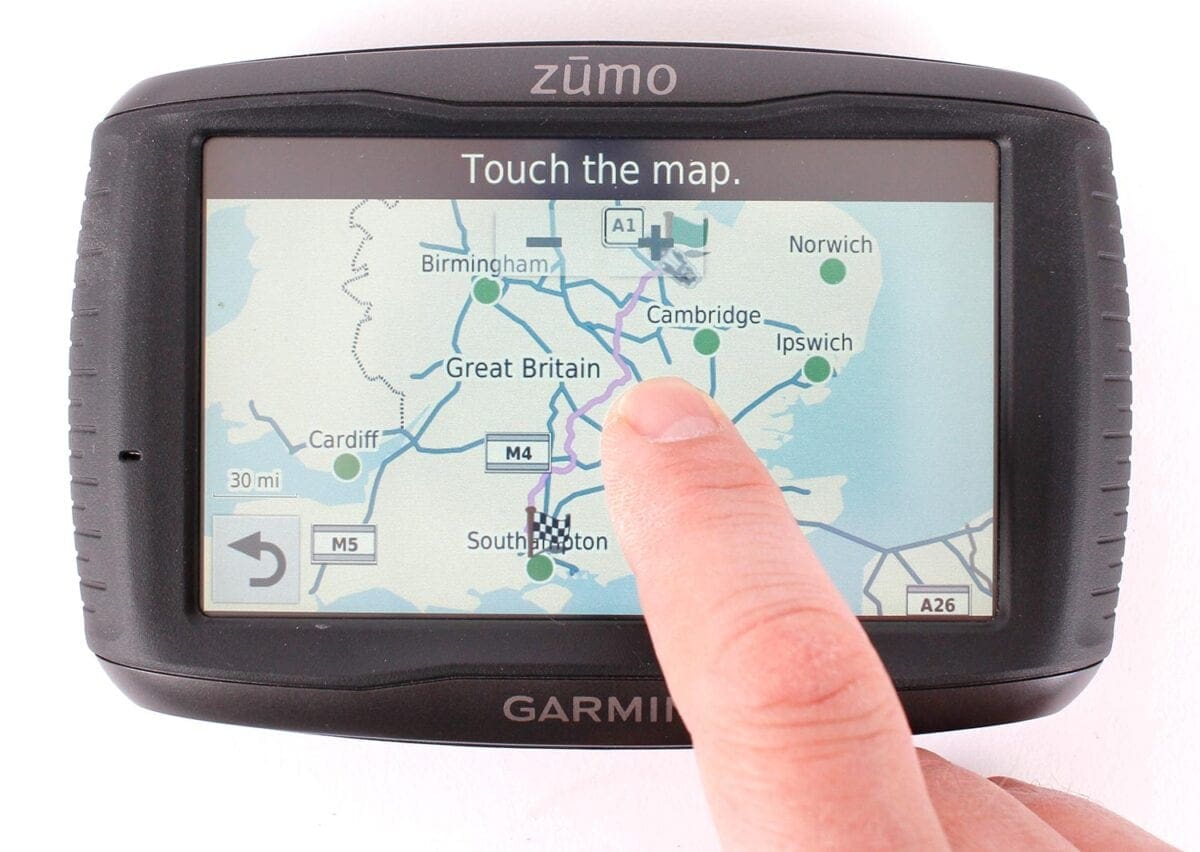
Also impressive, though not available in the round trip planner, is the route shaper – when a journey is planned, simply touch the map and the route will recalculate to accommodate that point. A trip planner also makes adding destinations simple, while ‘Scheduling’ is pure genius, allowing you to add the time you want to arrive at each point in a route, as well as how long you want to stop.
In map mode, by clicking on your vehicle/pointer, you’re immediately shown your coordinates, nearest junction, nearest address and buttons for hospital, police station, petrol station and another that tells you the AA’s number. There’s also the option for off-road navigation, which doesn’t look for byways, but simply plots a straight line to your destination.
Customisable display
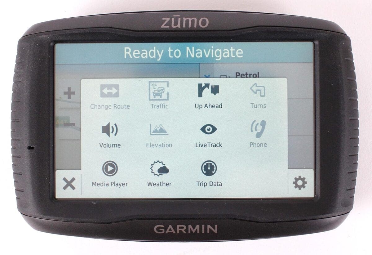
Tabs on the right of the main map can be used to display upcoming Points Of Interest (like petrol stations), trip data, bearing and, if your phone’s connected, weather reports (brilliant!), the music player, and traffic. Generally, it’s not as elegant as TomTom’s scrolling sidebar (and doesn’t have the great average speed display when riding through SPECS zones), but it is more versatile.
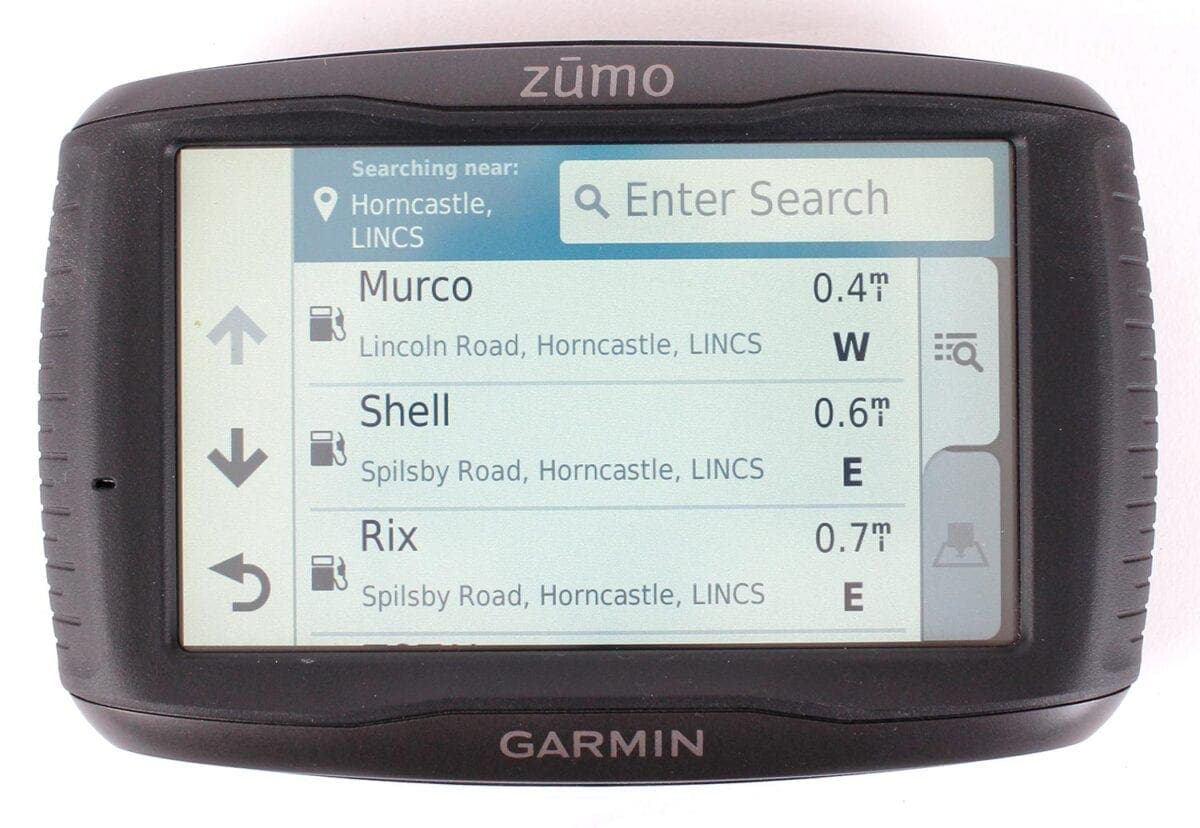
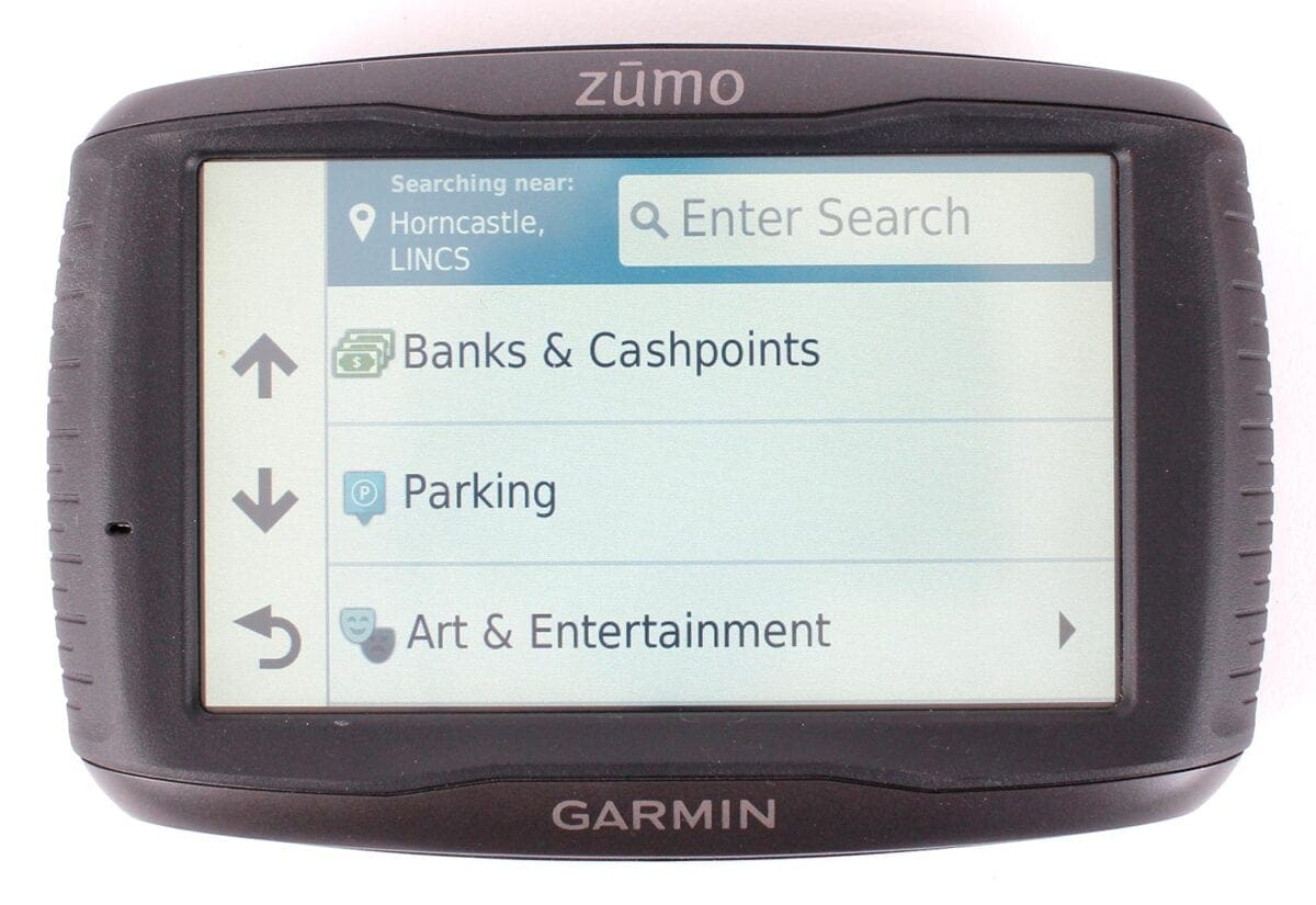
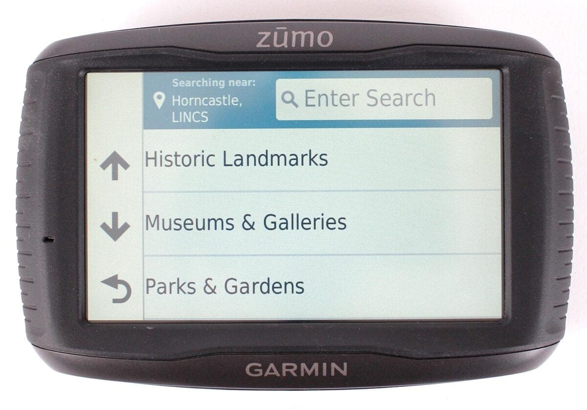
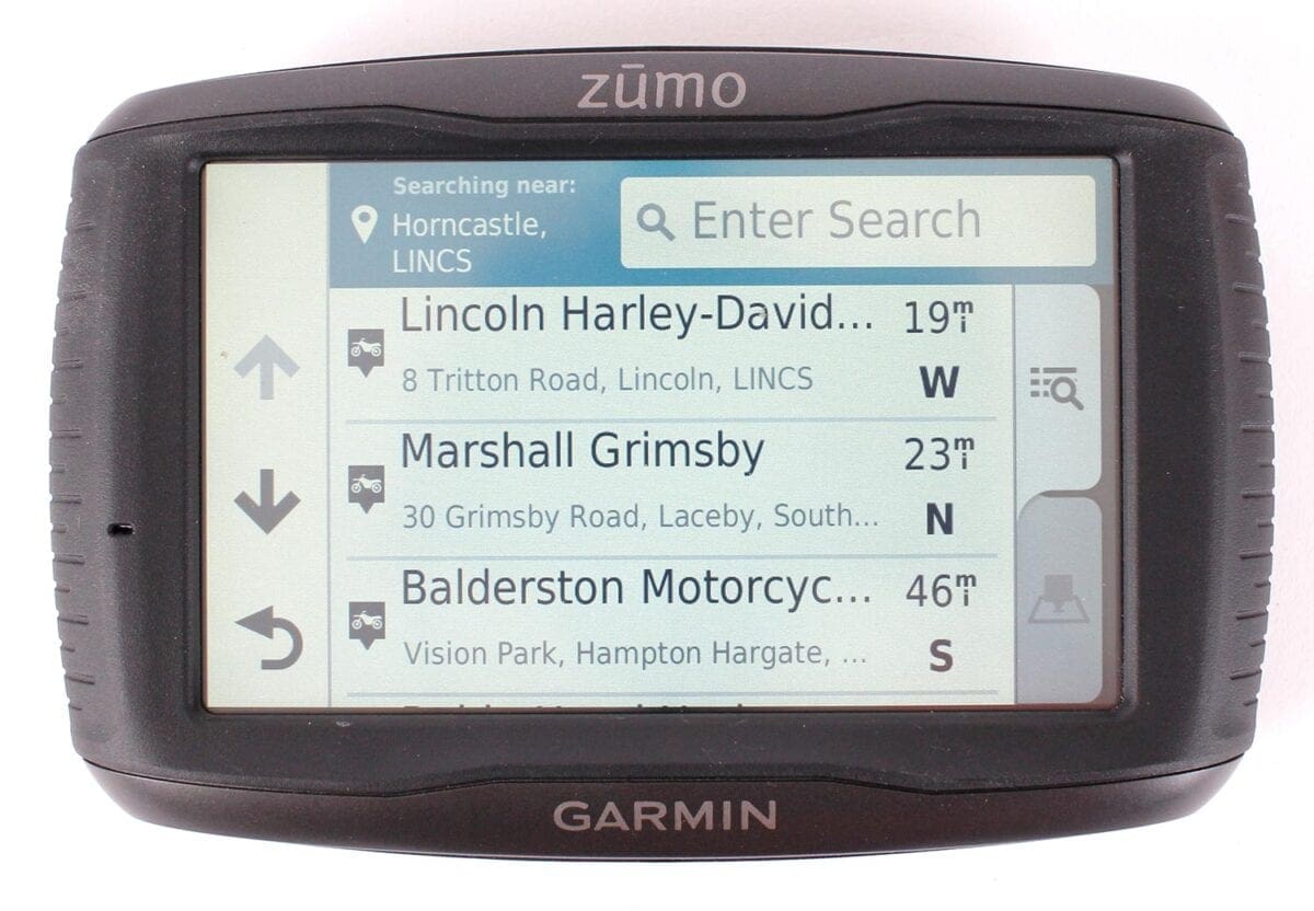
There are plenty of search options, like historical locations and zoos, though some give better results than others. Four Square gives you further results using your smartphone app. There are a lot of POI overlays too (like McDonalds), but they can be to the detriment of the map’s legibility.
Very cleverly, the device recognises when it’s in the car or the motorcycle mount, and will remember the planning options for that location, so if you use ‘Adventurous’ planning on the bike, the unit can revert to the fastest route in the car. Another advantage of this is the ‘Dynamic Fuel Tracking’, which only operates with the bike mount. You tell it the range of your bike’s tank, and it can programme the next three fills in the journey. It gives quick access to nearby petrol stations when it thinks you’re getting low, and recognises when you’ve stopped, asking if you’re filling up to automatically reset itself. This would be particularly useful in more remote areas overseas, but in the UK I’ve found the scrolling sidebar of the TomTom, which shows the next two fuel stops within 35 miles on the route, to be more useful, as I’m not taken away from my roads to find fuel, and can judge the need myself.
The Garmin’s pronunication is slightly less clear than the TomTom, but still good, and while it’s also fractionally slower to recalculate when off course, there’s little in it. Both plan subtly different routes – on one journey I deliberately went a different way, the Garmin spending longer asking me to turn around, while the TomTom more quickly found a different route. Planning Adventurous routes is very fast though – taking just one minute instead of the TomTom’s 30 in some cases, but remember that the TomTom will look at many more minor roads… it’s worth the wait.
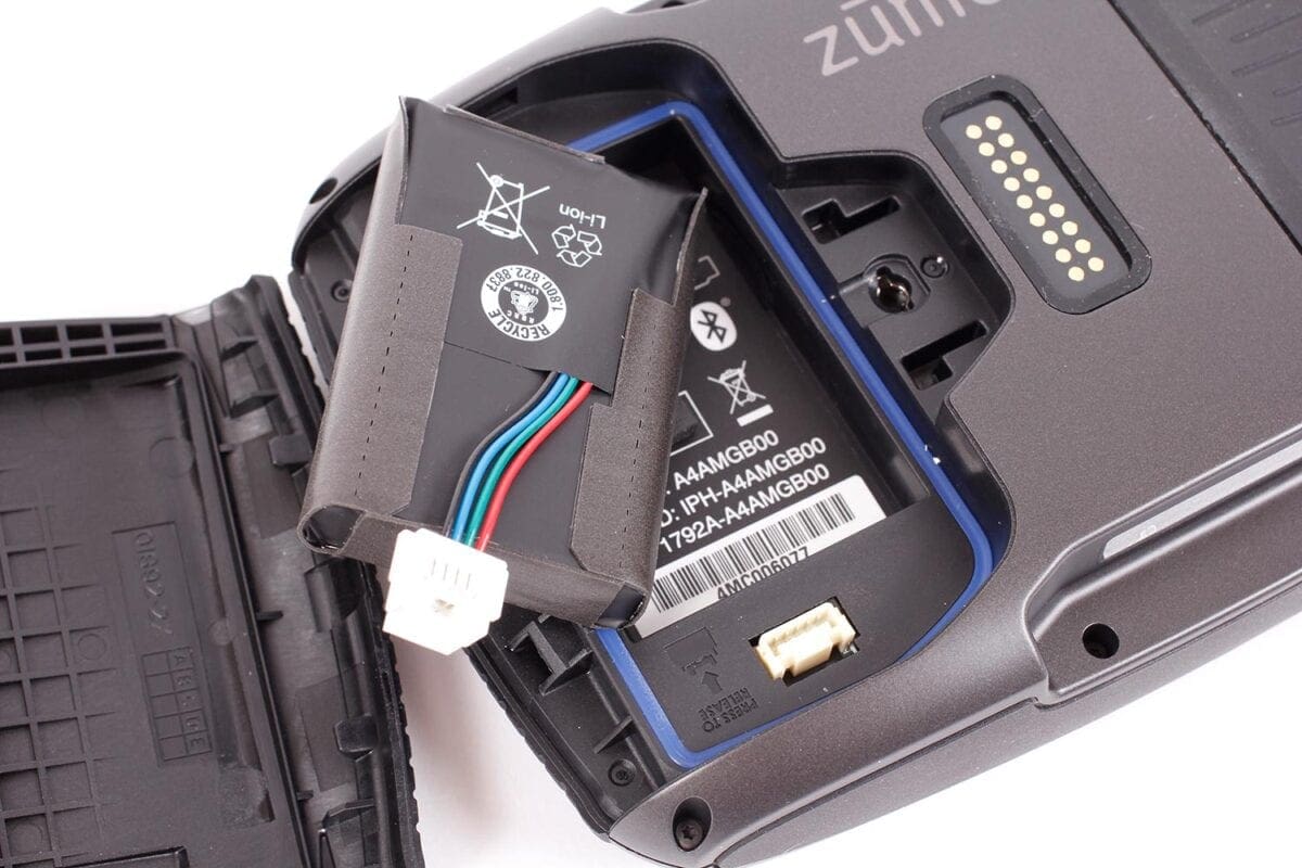
As I often ride many different bikes, I appreciate the TomTom’s excellent battery life – I can tuck the unit into a tank bag, and have enough juice for a good four-hour ride or more. The Garmin, while it does have a removable battery (replacements are £41.99), can only manage about an hour and a half. Most people will be using a powered mount, but this could be frustrating when programming routes on the device before riding. Routes can of course be programmed on a computer, using Garmin’s BaseCamp (very complicated), or any other software capable of generating a GPX file, and are uploaded via the USB port from Mac or PC. Unlike the TomTom, wireless uploads aren’t possible. Oh, and when charging with a USB cable at home, the Garmin won’t charge if it’s turned off.
The Garmin is more customisable than the TomTom – how valuable you find this depends on how much you enjoy tinkering, but the wealth of options can make it feel cluttered. Invest time learning all of the Garmin’s features however, and it will reward you.
The choice between the Garmin and TomTom is not an easy one – while the TomTom is incredibly capable, the Garmin ultimately has more features for those who want to programme the minutiae of their routes. TomTom owners can get the most thrilling rides by leaving the device to do the work for them, and they benefit from a far superior screen, but Garmin users can fill their display with a huge amount of information. Neither is a clear winner, but each has very definite strengths…
Motorcycle Sport & Leisure magazine is the original and best bike mag. Established in 1962, you can pick up a copy in all good newsagents & supermarkets, or online…
[su_button url=”http://www.classicmagazines.co.uk/issue/MSL” target=”blank” style=”glass”]Buy a digital or print edition[/su_button] [su_button url=”http://www.classicmagazines.co.uk/subscription/MSL/motorcycle-sport-leisure” target=”blank” style=”glass” background=”#ef362d”]Subscribe to MSL[/su_button]
